
LinkedIn Carousel Checklist: What to Check Before You Publish
Use this LinkedIn carousel checklist to review hook, story, design, PDF export, caption, accessibility, and post performance before publishing.
A LinkedIn carousel can look polished and still fail because the hook is vague, the story is unclear, the text is too small, the PDF export is broken, or the caption gives readers no reason to swipe. Use this checklist before publishing a LinkedIn document post.
The short version: before publishing a LinkedIn carousel, check the hook, slide sequence, readability, design consistency, source accuracy, PDF export, document title, caption, CTA, accessibility, and tracking plan. For LinkedIn document posts, use a high-quality PDF, keep every page the same size, flatten complex PDFs, and check the file before uploading. LinkedIn Help document upload
1. Source checklist
Before you review slides, review the source idea.
Ask:
- Is this carousel about one clear topic?
- Is the audience obvious?
- Is the main takeaway specific?
- Are the examples accurate?
- Are any claims unsupported?
- Is there anything sensitive or confidential in the source?
- Could the idea be split into two stronger carousels?
SlideDrift’s best-practices guidance recommends starting with a clear source, one main topic, a clear audience, and specific points, examples, or lessons. SlideDrift llms full
If the source is still messy, use the notes-to-carousel guide. If the source is already a public article, use the URL-to-carousel guide.
2. Hook checklist
The first slide should make a specific promise.
Check:
- Would the right reader know this is for them?
- Is the hook concrete?
- Does it avoid vague words like “success,” “growth,” or “tips” without context?
- Does it create curiosity without clickbait?
- Is it short enough to read quickly?
- Does it match the actual carousel?
Weak hooks:
- “Marketing tips”
- “How to be better at LinkedIn”
- “Things I learned”
Stronger hooks:
- “Your LinkedIn content is not too long. It is too unfocused.”
- “5 signs your client onboarding process creates scope creep.”
- “Before you hire a consultant, answer these 9 questions.”
3. Slide sequence checklist
A carousel should feel like a short argument.
Check:
- Does slide 2 naturally follow slide 1?
- Does every slide move the idea forward?
- Is there repetition?
- Is anything missing between the problem and the solution?
- Does the final slide resolve the promise from the first slide?
- Could a reader understand the carousel without reading the caption?
A simple sequence:
| Slide | Job |
|---|---|
| 1 | Hook |
| 2 | Context |
| 3 | Problem |
| 4 | Insight |
| 5 | Example |
| 6 | Framework or checklist |
| 7 | Recap |
| 8 | CTA |
Review the story before spending time on design polish.
4. Copy checklist
Good carousel copy is compressed but not vague.
Check:
- One idea per slide.
- Short sentences.
- No filler introductions.
- No duplicated points.
- No unsupported statistics.
- No generic advice without examples.
- Clear verbs.
- Concrete nouns.
- Practical takeaway.
Replace:
“Communication is important for project success.”
With:
“A weekly update should track decisions, blockers, and next actions. Not activity.”
5. Accuracy checklist
This is especially important for AI-generated or AI-assisted drafts.
Check:
- Are all numbers sourced or removed?
- Are claims about LinkedIn, SEO, tools, or pricing current?
- Are competitor claims fair and verifiable?
- Are legal, financial, or medical claims avoided unless reviewed by an expert?
- Are quotes accurate?
- Does the carousel avoid pretending opinion is fact?
Google’s AI content guidance says quality matters more than how content is produced, but using automation primarily to manipulate search rankings is against spam policies. The same principle applies to carousel production: use AI to structure and speed up work, then verify the output. Google AI content guidance
6. Design checklist
Design should make the idea easier to read.
Check:
- The title hierarchy is clear.
- Body text is readable on mobile.
- There is enough contrast.
- Spacing is consistent.
- Alignment is intentional.
- The same visual system carries across the deck.
- Important text is not too close to the edge.
- Images support the idea.
- No slide looks overcrowded.
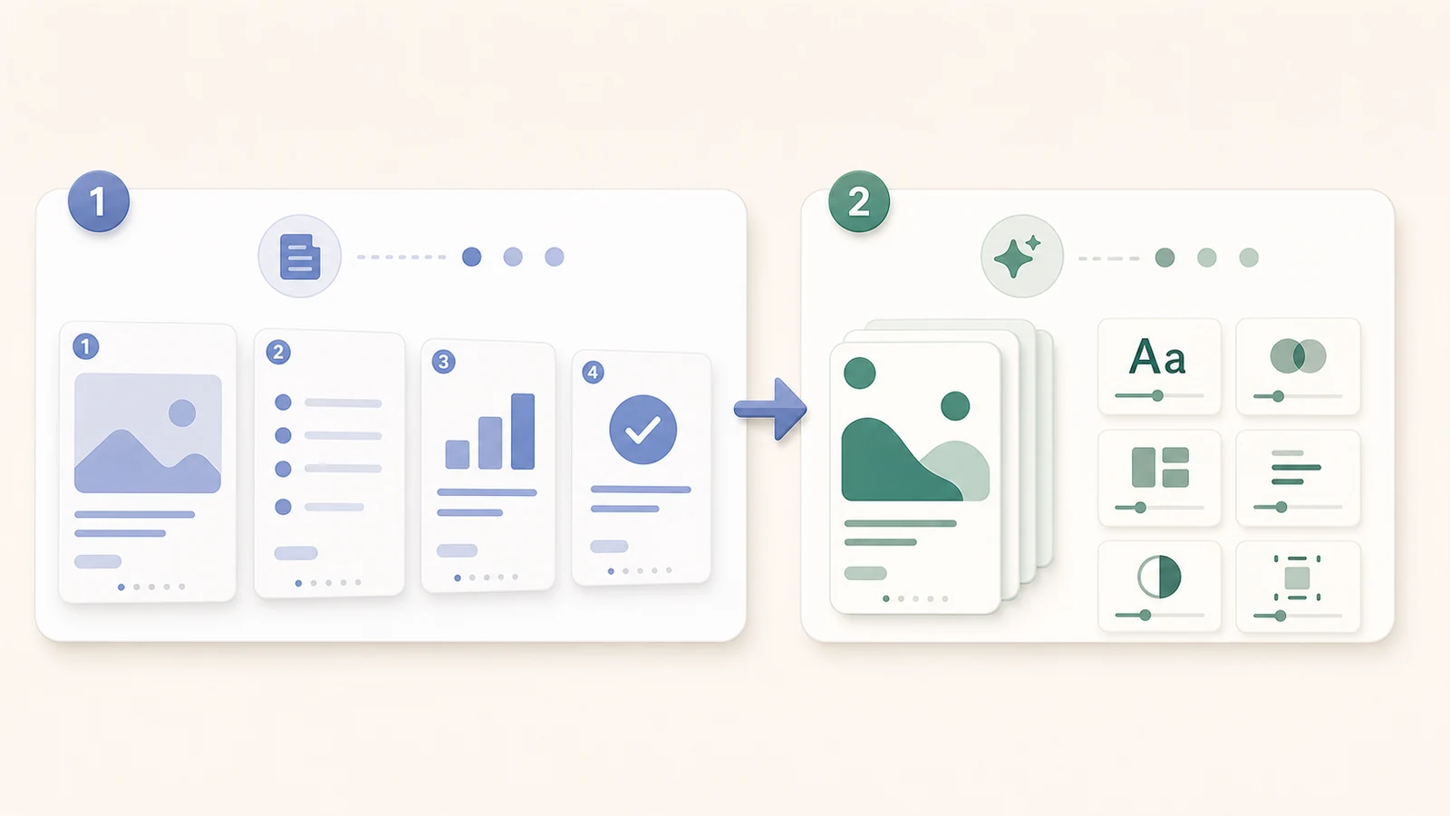
If using SlideDrift, review the deck in the editor and adjust copy, slide order, design controls, images, and brand settings before export. SlideDrift’s docs describe the editor as the place to refine and prepare the carousel for export. SlideDrift docs
7. Brand checklist
A carousel does not need to be flashy, but it should look recognizably yours.
Check:
- Colors match your brand.
- Fonts are consistent.
- Tone matches your normal voice.
- Logo use is subtle, if used.
- The deck does not look like a different brand on every slide.
- The design works even without a logo.
SlideDrift’s brand kit docs describe brand profiles that can include name, primary color, secondary color, heading font, body font, tone, and optional advanced colors. SlideDrift brand kits
8. Accessibility checklist
Make the carousel easier to consume.
Check:
- Text is readable at mobile size.
- Contrast is strong.
- Decorative text is not essential.
- Images are not carrying critical information without explanation.
- The caption summarizes what the carousel is about.
- The PDF title is clear.
- The final post has useful context.
For blog images around the carousel, Google recommends descriptive filenames, captions near relevant text, and useful alt text without keyword stuffing. Google image SEO
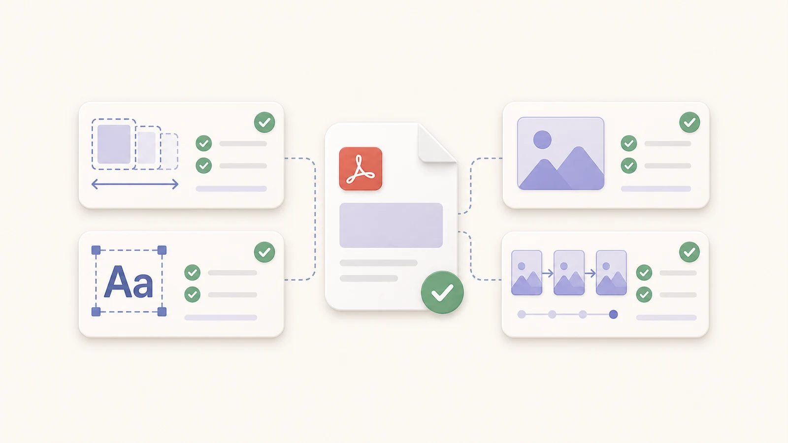
9. PDF export checklist
Before uploading to LinkedIn, check:
- Export is a PDF.
- File size is under 100 MB.
- Every page is the same size.
- The PDF opens correctly.
- Fonts render properly.
- Images are not blurry.
- Complex layered PDFs are flattened or merged.
- No animations are required.
- Slide order is correct.
- The first page is the intended cover.
LinkedIn’s help page says PDFs with multiple layers should be flattened or merged, videos and animations display as static images, and PDFs with multiple sized pages must be fit to the same page size. LinkedIn Help document upload
SlideDrift’s PDF export guide also recommends opening the file and checking that every slide looks right before upload. SlideDrift export PDF
If you are unsure whether your slides are the right shape before exporting, compare the recommended dimensions in the LinkedIn carousel size guide.
Check the exported PDF before uploading it to LinkedIn.
10. Caption checklist
Your caption should not repeat every slide. It should set context.
Check:
- Does the first line make people want to open the carousel?
- Does the caption explain why this matters?
- Does it identify the audience?
- Does it avoid dumping the whole article into the caption?
- Is there a clear CTA?
- Are mentions and hashtags used sparingly?
- If there is a link, is it necessary?
Example caption:
Most onboarding problems start before the first kickoff call.

I made this carousel because I keep seeing the same pattern:
teams define deliverables before they define decisions.

Swipe through for the 7-point pre-project checklist.
11. CTA checklist
Choose one CTA.
Good CTA options:
- “Save this before your next kickoff.”
- “Comment with the mistake you see most often.”
- “Send this to someone planning a project.”
- “Use this checklist before your next proposal.”
- “Follow for more practical frameworks.”
- “Try turning your own notes into a carousel.”
Avoid stacking five CTAs. A carousel with too many asks feels unfocused.
12. Internal link checklist
If the carousel supports a related article, tool, or template page, add one useful link in the caption, comments, newsletter follow-up, or repurposed blog post. Do not force links into the carousel slides if they distract from the main point.
13. Post-publish checklist
After publishing:
- Record the post URL.
- Track impressions, reactions, comments, shares, and saves if available.
- Note the hook used.
- Note the format used: checklist, framework, mistakes, case study, etc.
- Save comments that reveal future article or carousel ideas.
- Repurpose the best section into a follow-up post.
- Add internal links if the carousel supports a blog article.
Ordinal’s LinkedIn link study recommends testing with your own data because aggregate trends are useful but every account, audience, and content format behaves differently. Ordinal LinkedIn link penalty study
One-page checklist
Copy this before publishing:
SOURCE
[ ] One clear topic
[ ] Clear audience
[ ] Specific takeaway
[ ] No sensitive information

HOOK
[ ] Specific first slide
[ ] Not clickbait
[ ] Matches the carousel

STORY
[ ] Logical slide order
[ ] One idea per slide
[ ] No repetition
[ ] Useful final slide

COPY
[ ] Short sentences
[ ] Concrete examples
[ ] No unsupported claims

DESIGN
[ ] Readable on mobile
[ ] Strong contrast
[ ] Consistent spacing
[ ] Brand style applied

PDF
[ ] PDF exported
[ ] Same page size
[ ] Under 100 MB
[ ] Opens correctly
[ ] Slide order correct

POST
[ ] Clear document title
[ ] Contextual caption
[ ] One CTA
[ ] Tracking plan
Final recommendation
Do not publish a carousel just because it looks finished. Check the story, copy, design, export, and caption. Use SlideDrift to generate and edit the deck, then use this checklist before exporting the PDF and posting it to LinkedIn.
FAQ
What should I check before publishing a LinkedIn carousel?
Check the source idea, hook, slide order, copy, accuracy, design, brand consistency, accessibility, PDF export, caption, CTA, and tracking plan.
What is the best export format for a LinkedIn carousel?
PDF is usually the best format for a LinkedIn document carousel. Check that the file opens correctly, every page is the same size, and the file is under LinkedIn’s document limits.
How do I make a LinkedIn carousel more readable?
Use one idea per slide, large titles, short sentences, strong contrast, consistent spacing, and enough margin. Preview the carousel at mobile size before publishing.
Should every LinkedIn carousel have a CTA?
Yes, but use one clear CTA. Ask readers to save, comment, share, follow, use a checklist, or try a related workflow.