How to Bold Text in a LinkedIn Post (and When Not To)
LinkedIn posts have no bold button. Here's how to bold text with a formatter, where LinkedIn has real bold, and what Unicode bold costs your readers.
Standard LinkedIn posts have no rich-text controls, so you can't bold text the way you would in an email. So the answer to how to bold text in a LinkedIn post is a formatter: paste your text, select a word, press Bold, then copy it into LinkedIn. It swaps your letters for bold-looking Unicode characters. That works, but it has costs, so bold a few words, not whole sentences.
- Where bold works: posts versus articles and newsletters.
- Step by step: on a computer or a phone.
- The costs: screen readers, search and character counts.
- When to use it: three patterns, and other ways to add emphasis.
- A worked example: an accountant's year-end checklist.
Can you bold text on LinkedIn?
It depends where you're writing.
| Where | Real bold? | What to do |
|---|---|---|
| Posts | No | Use a formatter, sparingly |
| Articles | Yes | Use the editor's toolbar |
| Newsletters | Yes | Use the editor's toolbar |
Standard posts don't come with rich-text controls, so there's no bold to select in the post box. Articles and newsletters are different. LinkedIn's guide to writing articles describes a toolbar where you can bold or italicize text and add lists and blockquotes, and newsletter editions are published from the same editor. You can format there the normal way.
If your text is long enough to need headings and several bold phrases, it may belong in an article or a carousel rather than a post.
Paste your notes, see them as a carousel
SlideDrift drafts the slides from your notes, a post or a link. Edit them, then export the PDF to post.
How to bold text in a LinkedIn post, step by step
Any Unicode text formatter works the same way. Here's how it goes with SlideDrift's free LinkedIn text formatter, which runs in your browser and doesn't need an account.
- Write or paste your post into the formatter's editor.
- Select the words you want in bold.
- Press Bold in the toolbar (⌘B works too).
- Check the preview. It shows the post as LinkedIn's feed draws it on a phone or a computer, cut where "…more" appears.
- Copy the text and paste it into LinkedIn's post box.
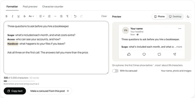
The same toolbar has italic, underline and strikethrough. Bold italic, serif and monospace styles sit under Aa. If you change your mind, undo the change.
On a phone
Posts in the LinkedIn app have no rich-text controls either. Open the formatter in your phone's browser, format the text there, copy it, then paste it into the app's post box. It's often easier to write the post on a computer and schedule it, then check it on your phone once it's live.
In articles and newsletters
Don't use a formatter here. Select the text in LinkedIn's article editor and use its own bold control. Real bold keeps your words as normal letters, so screen readers and search read them as written.
What Unicode bold costs your readers
A formatter doesn't make text bold. It replaces each letter with a different character that looks like a bold letter. Those characters come from a part of Unicode meant for maths. The Unicode Standard, in its chapter on letterlike symbols, says they "should not be used to represent styling of nonmathematical text." Unicode's own report on mathematics adds that they can be confused with styled text.
Here's what that means in practice.
Screen readers may stumble. Per Axbom's guide to faking bold with Unicode, screen readers most often skip these characters, or read out a long explanation of each one, so a whole sentence in fake bold can be hard to follow. Your clients and their staff may include people who use a screen reader.
Search may not match the word. The same guide says text encoded this way won't be found through search engines. To software, a Unicode bold "audit" isn't the same string as a plain "audit."
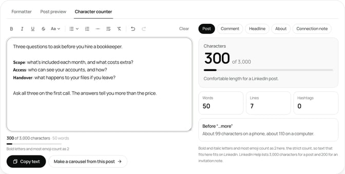
Bold letters can count double. LinkedIn's help page on posting allows up to 3,000 characters per post. SlideDrift's free LinkedIn character counter counts bold and italic letters and most emoji as two characters, the strict count, so text that fits there fits on LinkedIn. A heavily formatted post can hit the limit sooner than you expect.
It can look different on some devices. Axbom's guide notes that some older devices may replace the characters with question marks, and fonts differ in how they draw them.
None of this rules bold out. It means a few bold words are fine, and a fully bold post isn't.
When bold helps and when it hurts
Use bold to help a skimming reader find their way. Don't use it to shout.
Good uses:
- Labels in a list, like "Step 1" or "Before" and "After," so readers can scan.
- One key phrase in a long post, such as the deadline or the one rule that matters.
- A short section marker in a post with two or three parts.
Avoid:
- The whole first line. Your hook should work on its own words. A fully bold hook is the hardest line for a screen reader, and it's the line every reader sees. Our LinkedIn hook examples show how strong openings read in plain text.
- Names, numbers and hashtags. Keep them in plain letters so people can search for them and copy them.
- Several styles in one post. Bold, italic and monospace together make a post look busy. Pick one.
- Emphasis on every line. If everything is bold, nothing stands out.
A useful test: read the post with the bold removed. If it still makes sense, the bold is decoration, and that's fine in small doses. If it only makes sense with the bold, rewrite the sentence.
Three bold patterns that read well
These patterns use bold for structure, not volume. The examples are made up; swap in your own details.
The labelled list. Bold only the label at the start of each line, then explain in plain text.
Three things to check before you sign a lease:

𝗕𝗿𝗲𝗮𝗸 𝗰𝗹𝗮𝘂𝘀𝗲: when you can leave, and what it costs.
𝗥𝗲𝗻𝘁 𝗿𝗲𝘃𝗶𝗲𝘄: how the rent changes, and how often.
𝗥𝗲𝗽𝗮𝗶𝗿𝘀: who pays to fix what.Before and after. Bold the two markers so readers can compare at a glance.
𝗕𝗲𝗳𝗼𝗿𝗲: "We provide innovative HR solutions."
𝗔𝗳𝘁𝗲𝗿: "We write HR policies for companies of 20 to 200 people."One key phrase. In a longer post, bold the single line a reader must not miss, such as a deadline. Leave everything else plain.
If you file your own return, the deadline is the same as last year.
𝗦𝘁𝗮𝗿𝘁 𝗴𝗮𝘁𝗵𝗲𝗿𝗶𝗻𝗴 𝗿𝗲𝗰𝗲𝗶𝗽𝘁𝘀 𝗻𝗼𝘄, not in the last week.Each of these keeps the meaning in the words. Remove the bold and the post still works. For more post structures to fill in, see the LinkedIn post templates, and the how to post on LinkedIn guide covers the post box itself, step by step.
Other ways to add emphasis without bold
Plain text has more tools than people think.
- Line breaks. Put the important sentence on its own line, with a blank line before it.
- Short sentences. A short line after two long ones stands out without any formatting.
- Numbered lists and bullets. They give a post structure. The formatter adds both.
- A separator line between sections of a longer post.
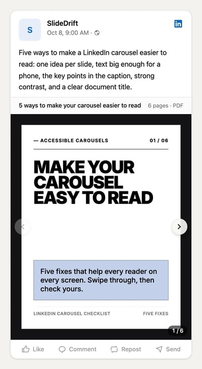
- A carousel when the post has steps, a checklist or a framework. Headings and bold type work normally on slides, and you can put the key points in the caption for anyone who can't see the slides.
The LinkedIn post design guide covers how to make text posts and visuals easy to scan. For carousels, our guide to accessible LinkedIn carousels shows how to write a caption that carries the same points in plain text.
How to change bold after you post
LinkedIn lets you edit the text of a post after it's published, and marks it as edited. To remove bold, retype the bold words as plain text in LinkedIn's edit box. To add bold, format the words in the formatter, copy them, and paste them over the plain ones.
If you plan to reuse a post later, keep a plain-text copy of it. It's easier to start from plain words than to undo formatting.
Worked example: an accountant formats a year-end checklist
Tom is a made-up accountant who works with small business owners. In November he writes a post listing the five documents he wants from every client before year-end. His first draft is a single paragraph, and it's hard to scan.
He rewrites it as a short list in the formatter:
- He keeps the hook plain: "Five documents I need from you before 31 December."
- He puts each document on its own line and bolds only the label, such as Bank statements: followed by a plain explanation.
- He keeps the date and the numbers in plain text.
- He ends with one plain question: "Which one is hardest to find?"
The preview shows the hook and the first label above the "…more" cut on a phone. The counter shows the bold labels added a few dozen characters, well under the limit. He copies the post into LinkedIn.
Comments ask for more detail on two of the documents, so he turns the list into a carousel for the following week. Here's his brief:
SlideDrift brief
Make a 6-slide LinkedIn carousel for owners of small businesses.
Goal: show them the five documents to send their accountant before year-end, so nothing holds up their accounts.
Structure: a hook slide ("Five documents to send before year-end"), one slide per pair of documents with what each one shows, a slide on when to send them, and a closing question for readers.
Tone: calm, practical and plain. General information, not advice for any one business.
Avoid: invented statistics, client names and promises about tax savings.The carousel's slides use real bold headings, and the caption repeats the five documents in plain text.
FAQ
Can you bold text in a LinkedIn post?
Not with a LinkedIn button. Standard posts don't have rich-text controls, so people use a formatter that swaps letters for bold-looking Unicode characters, then paste the result into LinkedIn.
Is it safe to use bold text on LinkedIn?
Yes, it's widely used and the text posts normally. The costs are for readers: screen readers may stumble, search may not match the words, and bold letters count double. Bold a few words, not whole sentences.
How do I bold text on LinkedIn on my phone?
Open a formatter in your phone's browser, select the words and press Bold, then copy the text and paste it into the LinkedIn app's post box.
Can you bold text in LinkedIn comments?
The Unicode letters a formatter makes are just text, so you can paste them anywhere you type. Comments are short, though, so plain text usually reads better there.
Do LinkedIn articles support bold text?
Yes. LinkedIn's article editor, which you also use for newsletter editions, lets you bold or italicize text and add lists and blockquotes. Use it instead of a formatter there.
Why does my bold text look wrong on some devices?
The device or app reading the post may not have a font with those Unicode characters. Axbom's guide notes that some older devices replace them with question marks. Plain text avoids the problem, which is another reason to bold only a few words.
Does bold text affect how many people see my post?
LinkedIn's page on how the feed works says it looks at what a post is about and whether it provides knowledge or advice. Clear words and a useful post matter more than styling.
Turn a formatted post into a SlideDrift carousel
When a post grows into steps or a checklist, a carousel can hold the structure that bold text strains to. Paste the post into SlideDrift and it drafts the slides for you to edit.
Turn your post into a carousel
Paste your post or notes. SlideDrift drafts the slides in your brand with real headings; you edit them, then export the PDF or schedule the post.


Brief for this carousel
Make a 6-slide LinkedIn carousel for owners of small businesses on the five documents to send your accountant before year-end. A hook slide, one slide per pair of documents, a slide on when to send them, and a closing question for readers.