LinkedIn Post Format: How to Structure a Post You Can Reuse
The LinkedIn post format that works for experts: a hook, a short body and one close, laid out with line breaks. Plus when to move the idea into a carousel.
The LinkedIn post format that works for experts has three parts: a hook in the first one or two lines, a body of short paragraphs with a blank line between each, and a close that asks for one thing. Keep it under LinkedIn's 3,000-character post limit, and write it so the first lines make sense on their own, because the feed hides the rest behind "…more".
Below: each part in turn, a line-break layout that reads on a phone, a skeleton to reuse every week, and when an idea belongs in a carousel instead.
The LinkedIn post format at a glance
Every post you write as a consultant, adviser or lawyer can follow the same shape. The topic changes; the structure doesn't.
| Part | Its job | Typical length | Layout |
|---|---|---|---|
| Hook | Make the right reader tap "…more" | 1 to 2 lines | Its own line, then a blank line |
| Body | Deliver the point | 3 to 6 short paragraphs | 1 to 3 sentences each, blank line between |
| Close | Ask for one thing | 1 to 2 lines | Its own line at the end |
LinkedIn's help page on posting and sharing updates says a post can contain up to 3,000 characters. Most good posts use far less. If you're near the limit, the LinkedIn character limit guide covers what to cut, and the same help page points you to an article for anything longer.
If you want ready-made versions of this shape for specific jobs, such as the client question, the myth or the checklist, see the 15 LinkedIn post templates. This guide is the frame underneath them.
Paste your notes, see them as a carousel
SlideDrift drafts the slides from your notes, a post or a link. Edit them, then export the PDF to post.
Part 1: the hook
The hook is the first one or two lines, the part people see before "…more". Its only job is to tell the right reader that the post is for them.
LinkedIn doesn't publish where the "…more" cut falls. It depends on the screen, the line breaks and the length of your words. So write as if only the first line and a half will show.
A hook that works for experts usually does one of these:
- Names the reader's problem. "Most small firms sign their first lease without asking four questions."
- States a specific result or detail. "A client cut their month-end close from nine days to four. Here's what changed."
- Asks the question clients ask you. "Do I need a solicitor to review a two-page contract?"
Put the hook on its own line, then leave a blank line. A hook that runs straight into the body loses its weight, and on a phone the second sentence may fall below the cut.
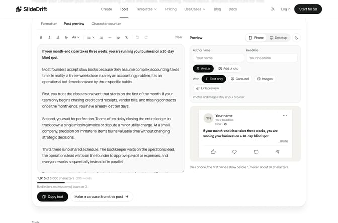
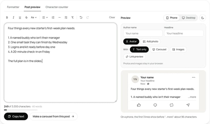
SlideDrift's free LinkedIn post preview shows an approximate fold in desktop and mobile-style views. Treat it as a planning aid, not an exact copy of LinkedIn. For fifty first lines sorted by type, see the LinkedIn hook ideas.
Part 2: the body
The body delivers what the hook promised. Keep to one point per paragraph and one idea per post.
Most expert posts take one of three body shapes. Pick the one that matches what you're saying:
- Steps or a list. Use numbers when order matters and hyphens or plain lines when it doesn't. Three to five items is easy to scan; more than seven is a sign the post wants to be a carousel.
- A short story. Situation, what happened, what you learned. One paragraph each, in that order.
- An argument. Your view, the reason, an example from your work, and what you'd do instead.
Three rules keep any body readable:
- Lead each paragraph with its point. A reader skimming the first words of each paragraph should get the gist.
- Use your own detail. Numbers from your own work, the question a client actually asked, the thing you changed. LinkedIn's guidance on AI-generated content says posts that feel generic or lack a clear point of view are less likely to be widely distributed.
- Cut the warm-up. If your first body paragraph explains why the topic matters, delete it and check whether the post still works. It usually does.
Part 3: the close
The close tells the reader what to do now. Ask for one thing only: a question to answer in the comments, a resource to request, or a next step to take. Two asks split attention, and readers usually do neither.
Good closes are specific:
- "Which of these four would you ask first?"
- "If you'd like the full checklist, comment 'lease' and I'll send it."
- "Next time a supplier sends a renewal, check clause three before you sign."
If the close points to a link, remember that LinkedIn's help page on sharing photos says a post can include a URL link or an image, but not both at once. Decide which one the post needs before you write the close.
Line breaks and layout
Layout is where most posts fall apart. The same words read easily or not at all depending on where you press Enter.
Use this layout:
- A blank line between every paragraph. Paragraphs of one to three sentences, separated by white space, are easy to follow on a phone.
- No single-word lines. A line for every sentence turns the post into a column of fragments. Group related sentences.
- Plain list markers. Numbers, hyphens or simple arrows line up cleanly. Long rows of emoji make the list harder to scan.
- Emphasis on a few words at most. If you add bold, keep it to a short label, not whole paragraphs. The guide to bold text on LinkedIn covers how and when.
- Mentions and hashtags at the end. A row of hashtags in the hook pushes your real first line down.
Line breaks sometimes vanish when you paste a draft from a notes app or a document. If that happens, the free LinkedIn text formatter has clean line breaks, bullets and numbered lists with a live preview, so you can tidy the layout before you copy it into LinkedIn.
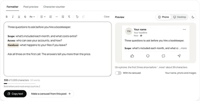
Before you post, read the draft on your phone. If you have to scroll back up to remember what a paragraph was about, it's too long.
A LinkedIn post skeleton you can reuse
Here's the structure as one skeleton. Copy it into your notes and fill the brackets each week.
[Hook: the reader's problem, a specific result, or a client's question. One line.]

[Context: one or two sentences on why this comes up in your work.]

[Point 1: one to three sentences.]

[Point 2: one to three sentences.]

[Point 3: one to three sentences.]

[What to do: the takeaway in one line.]

[Close: one question or one next step.]That's seven short blocks. Some posts need only two points; a story might swap the points for situation, outcome and lesson. The shape stays the same: hook, body, close, with a blank line between each block.
Reuse matters more than it sounds. When the structure is fixed, you spend your time on the substance, and readers learn how your posts read.
When to move the idea into a carousel
Some ideas outgrow a text post. Move it into a carousel when:
- The body has more than five steps or items, each needing its own explanation.
- Each point needs an example. A slide per point gives each one room.
- There's a before and after, or a comparison, that's easier to see than to read.
- You're near the character limit and the content is a list rather than an argument.
Keep it as text when it's one view with one reason, a short story, or a quick tip. A carousel built from a two-line idea feels padded.
When you do switch, the structure carries over. The hook becomes the first slide, each body point gets its own slide, and the close becomes the last slide. The post text above the carousel shrinks to a short version: the hook, one line of context and the close. LinkedIn's help page on document posts recommends PDF for the file you upload. For a fuller comparison, see LinkedIn carousels vs text posts.
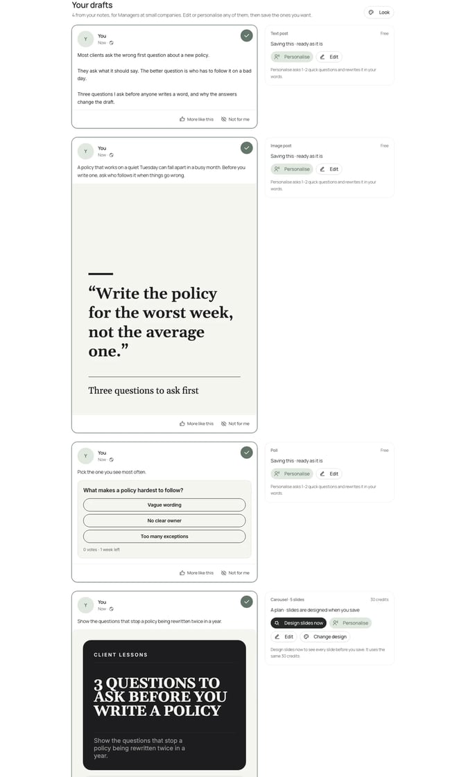
SlideDrift's Post ideas turns your notes, a link or an idea into carousel, image, text and poll drafts, so you can see the same idea in each format before you choose.
Worked example: an adviser restructures a lease post
Priya is a made-up business adviser who works with owners of small firms. She drafts a post about commercial leases. Her first version opens with "I've been thinking a lot about leases lately" and runs as one long paragraph of about 1,900 characters.
She rebuilds it with the format:
- Hook. "Most small firms sign their first lease without asking four questions." On its own line.
- Context. One sentence: she reviews leases with clients every month, and the same gaps come up.
- Body. Four short paragraphs, one per question: the break clause, the repair terms, the service charge and the rent review.
- Close. "Which of these would you ask first?"
The new version is shorter and reads cleanly on a phone. But in the preview, only the hook and the first question sit above the approximate fold, and each question needs an example to make sense. That's four points, each with an example: a carousel.
Priya keeps the hook, the context line and the close as the post text, and moves the four questions into slides. Here's her brief:
SlideDrift brief
Make a 6-slide LinkedIn carousel for owners of small firms about to sign a commercial lease.
Goal: help them spot the four lease terms most likely to cost them later.
Structure: a hook slide ("Four questions to ask before you sign a commercial lease"), one slide per question (break clause, repair terms, service charge, rent review) with a short explanation and an example, and a closing question for readers.
Tone: plain, practical and calm.
Avoid: invented statistics, legal advice and company names.The post text is now under 400 characters, and each question gets a slide of its own. After a few weeks, Priya compares this post with her text posts in LinkedIn's post analytics, which show impressions, members reached, reactions, comments, reposts and saves.
FAQ
What is the best LinkedIn post format?
For most experts: a one- or two-line hook, a body of short paragraphs separated by blank lines, and a close that asks for one thing. Use a carousel when the body is a list of steps or points that each need an example.
How do I add line breaks to a LinkedIn post?
Press Enter in the LinkedIn share box, and leave a blank line between paragraphs. If breaks disappear when you paste a draft, tidy it in a text formatter with a live preview, then copy it into LinkedIn.
How long should each paragraph be in a LinkedIn post?
One to three sentences. Short paragraphs with white space between them are easier to read on a phone. Avoid putting every sentence on its own line, which turns the post into fragments.
What should the first line of a LinkedIn post be?
A line that tells the right reader the post is for them: their problem, a specific result or a question clients ask you. LinkedIn hides the rest behind "…more", so the first line has to work alone.
How many characters can a LinkedIn post have?
LinkedIn's help page says posts can contain up to 3,000 characters. Most well-structured posts use far fewer. If you need more room, LinkedIn suggests writing an article instead.
When should I use a carousel instead of a text post?
When the body has more than five steps or items, when each point needs its own example, or when you're comparing two things. Keep one opinion, a short story or a quick tip as text.
Turn your structured post into a SlideDrift carousel
When a post has outgrown the text box, paste the draft into SlideDrift. It drafts the slides from your hook, points and close, and opens them in the editor for you to change. Pick a brand profile so the slides use your colours, fonts and logo, then export the PDF to upload to LinkedIn.
Turn your post into a carousel
Paste your draft or notes. SlideDrift drafts the slides in your brand, you edit them in the editor, then export the PDF.


Brief for this carousel
Make a 6-slide LinkedIn carousel for owners of small firms on the four questions to ask before signing a commercial lease. A hook slide, one slide per question, and a closing question for readers.