How to Make LinkedIn Carousel Posts More Accessible
LinkedIn has no alt text for carousels. Make yours readable with one idea per slide, phone-sized text, strong contrast, a summary caption and a clear title.
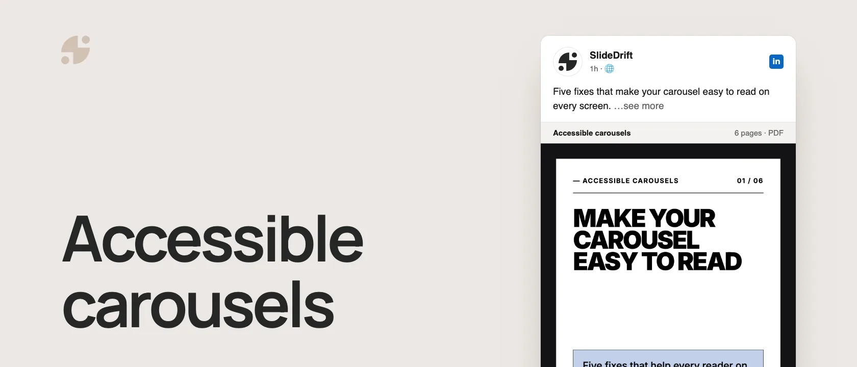
LinkedIn has no alt text field for carousels, so the slides have to be easy to read and the words that matter have to be in the post itself:
- One idea per slide, with a short heading and one supporting line.
- Text big enough for a phone, checked at phone size before you post.
- Strong contrast, at least 4.5:1 for body text.
- A caption that sums up the slides, so the key points exist as real text.
- A clear document title, because LinkedIn asks for one and readers see it.
- Alt text on image posts, which LinkedIn does support.
Why carousels need extra care
A LinkedIn carousel is a document post: a PDF readers swipe through. LinkedIn lets you add alt text to photos, but not to documents. Instead, it asks for a document title, and its help page says that "for accessibility purposes" people who can see your post can download the document as a PDF.
That download only helps if the PDF contains real text. Many carousel tools, SlideDrift included, export each slide as an image inside the PDF. A screen reader can't read words that are part of a picture, so the caption has to carry them.
Here's the carousel version, made in SlideDrift: five fixes, one per page, with large, high-contrast headings and body text. Every point on it is also in this article and in the caption we'd post with it.
SlideDriftCreate your ownCarousel transcriptShowHide


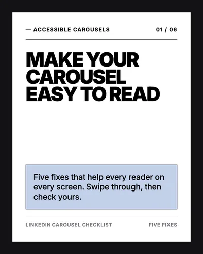
- 01Make your carousel easy to read. Five fixes that help every reader on every screen. Swipe through, then check yours.
- 02Fix 1, one idea per slide. A short heading and one supporting line. If a slide needs two paragraphs, split it in two.
- 03Fix 2, big enough for a phone. Open the exported PDF on your phone and read every page before you post.
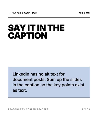
- 04Fix 3, say it in the caption. LinkedIn has no alt text for document posts. Sum up the slides in the caption so the key points exist as text.
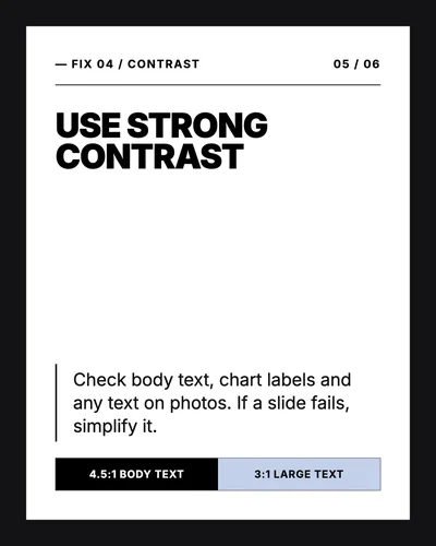
- 05Fix 4, use strong contrast. Check body text, chart labels and any text on photos. If a slide fails, simplify it. 4.5:1 for body text, 3:1 for large text.
- 06Fix 5, give it a clear title. LinkedIn asks for a document title. Describe the content, not the file name.
Give each slide one idea
Crowded slides are the most common problem. A heading, a paragraph, a chart, three icons and a footnote on one slide is hard for anyone to follow, and harder with low vision or on a small screen.
- One main idea per slide.
- One short heading.
- One supporting line.
- A visual only if it makes the point clearer.
If a slide needs two paragraphs, split it into two slides.
Make text big enough for a phone
Many people read LinkedIn on their phone, where a whole slide is only as wide as the screen. Text that looks fine on your monitor can become hard to read.
Avoid tiny chart labels, long footnotes, dense paragraphs, script fonts and narrow text columns. Use short headings, generous spacing, plain words and enough margin around the text. Then open the exported PDF on your phone and read every page. The carousel size guide covers the dimensions.
Check the contrast
Low contrast is the second most common problem: light gray text, pastel backgrounds, colored text on photos. The WCAG contrast guideline asks for at least 4.5:1 between normal text and its background, and 3:1 for large text.
Check body text, chart labels, the call to action, text on photos and small captions. If a slide fails, simplify it. A plain high-contrast slide beats a beautiful one nobody can read.
Keep important information out of pictures
WCAG's guidance on images of text says to use real text instead of pictures of text where you can. A carousel is pictures of text by nature, so make sure nothing important exists only on a slide:
- Put the key points in the caption.
- Say what a chart means in words, on the slide and in the caption.
- Keep charts to one message, with the takeaway labeled and no tiny legend.
Write a caption that sums up the slides
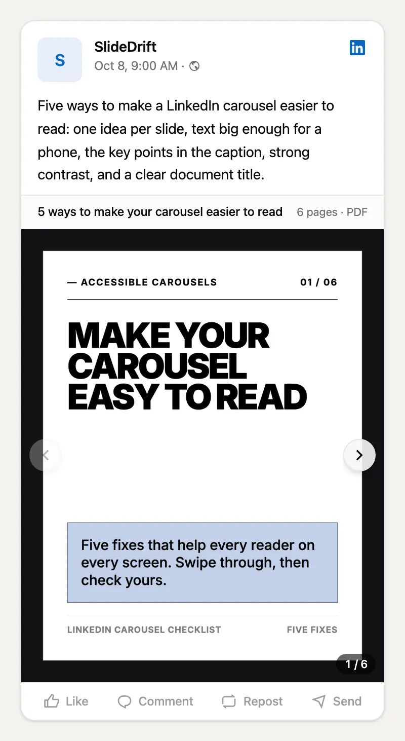
A caption like "New carousel!" tells a screen reader user nothing. Summarize what the slides say:
Five ways to make a LinkedIn carousel easier to read: one idea per slide,
text big enough for a phone, the key points in the caption, strong
contrast, and a clear document title.That gives everyone a text version of the main idea, and helps sighted readers decide whether to swipe.
Give the document a clear title
LinkedIn asks for a title when you upload a document, and it appears with the carousel. Make it describe the content ("5 ways to make your carousel easier to read"), not the file ("final-v3.pdf").
Add alt text to image posts
LinkedIn does support alt text for photos. After you add an image, select Alt text on desktop or ALT on mobile and describe what the image shows, as described on LinkedIn's photo help page. Describe the meaning, not the file:
- Weak: "LinkedIn graphic"
- Better: "Checklist with six ways to make a LinkedIn carousel easier to read"
Don't stuff alt text with keywords. Write it for the person listening to it.
Make it in SlideDrift
SlideDrift drafts the slides from your notes or a link. Then use the editor to cut slide text, reorder slides and adjust spacing until each slide makes one point, and check every page at phone size before you export.
If you schedule from SlideDrift, a single-image post needs alt text before it can be scheduled, and you can add alt text to each image in a multi-image post; SlideDrift sends it to LinkedIn with the post. For carousels, write the summary caption in the composer; scheduling LinkedIn posts explains the steps.
Make a readable carousel
Paste your notes or a link, edit each slide down to one idea, and check it at phone size before you export.
Brief for this carousel
Make a 6-slide LinkedIn carousel on making carousels easier to read. A cover, then one fix per slide: one idea per slide, text big enough for a phone, the key points written in the caption, strong contrast (at least 4.5:1 for body text), and a clear document title. Keep every slide short, with large, high-contrast text.
Accessibility checklist
Before you post
- Every slide is readable on a phone.
- Each slide makes one main point.
- Body text has at least 4.5:1 contrast with its background.
- Charts are simple and their takeaway is written out.
- The caption sums up the slides in plain text.
- The document title describes the content.
- Images in image posts have alt text that describes their meaning.
When you're done, run the full LinkedIn carousel checklist before you post.
FAQ
Can you add alt text to a LinkedIn carousel?
Not to a document post. LinkedIn supports alt text for photos, but carousels (documents) only get a title. Put the key points in the caption instead.
Are LinkedIn carousels accessible to screen readers?
Only partly. The caption and document title are text. The slides are usually images, so a screen reader can't read the words on them unless the PDF contains real text.
What contrast ratio should carousel text have?
At least 4.5:1 for normal text and 3:1 for large text, following the WCAG AA guideline.
What's the biggest accessibility mistake with carousels?
Putting small, low-contrast text on slides with no text version anywhere else. Fix it with bigger text, stronger contrast and a caption that sums up the slides.
Does SlideDrift help with accessible carousels?
It helps you keep slides simple and readable in the editor, and its scheduler requires alt text on single-image posts and lets you add it to each image in a multi-image post. Its PDF export draws each slide as an image, so add a summary caption to your carousel posts.