LinkedIn Carousel Templates for Reports and Research
Turn research reports into readable LinkedIn carousels: 12 templates for executive summaries, chart stories, benchmarks and caveats, with a real example carousel.

The best LinkedIn carousel templates for reports and research are an executive summary, a one-chart story, a trend breakdown, a benchmark explainer and a methodology caveat. Each one turns a dense report into a few findings people can follow, without stretching what the data says.
- Start with the question the data answers, not the sample size.
- Give each finding its own slide, with the number and its context.
- Keep the caveat: say what the data can't tell you, and name the source.
The research carousel rule
Don't start with the data. Start with the question the data answers.
Weak opening: "We analyzed 4,000 responses."
Better opening: "Most teams measure onboarding too late. Here's what the data shows."
The second version gives the reader a reason to swipe. The sample size still matters, but it belongs later, where it supports the finding.
Here's the executive summary template applied to a real report, Socialinsider's 2026 LinkedIn benchmark, as a carousel made in SlideDrift.
SlideDriftCreate your ownCarousel transcriptShowHide


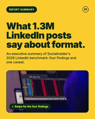
- 01What 1.3M LinkedIn posts say about format. An executive summary of Socialinsider's 2026 LinkedIn benchmark: four findings and one caveat.
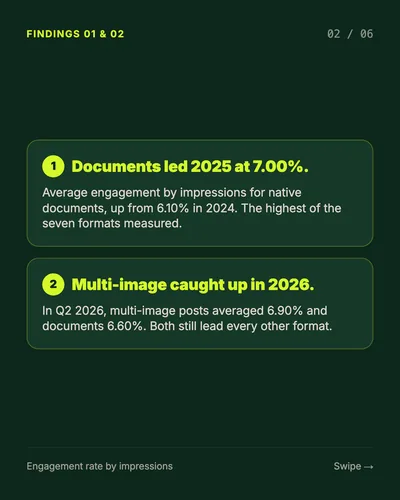
- 02Findings 01 and 02. Documents led 2025 at 7.00%: average engagement by impressions for native documents, up from 6.10% in 2024, the highest of the seven formats measured. Multi-image caught up in 2026: in Q2 2026, multi-image posts averaged 6.90% and documents 6.60%. Both still lead every other format.
- 03Finding 03. Brands post few documents: Pages averaged two document posts a month in 2025, against seven image posts and four link posts. The best-engaging format is still rare.
- 04Finding 04. Link posts trailed every other format: 3.25% average engagement in 2025, the lowest of the seven formats. Native documents: 7.00% in 2025, more than double the link post average. Averages across 16,645 business Pages.
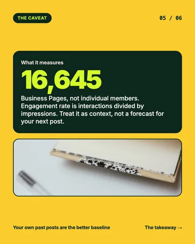
- 05The caveat. 16,645 business Pages, not individual members. Engagement rate is interactions divided by impressions. Treat it as context, not a forecast for your next post. Your own past posts are the better baseline.
- 06Test formats. Trust your own data. Try a document post: one idea, one page at a time. Compare like with like: same goal, same checkpoint. Read every benchmark's method before you quote its numbers. Source: Socialinsider, 2026 benchmark.
12 report and research carousel templates
| Format | Best use | Slide structure |
|---|---|---|
| Executive summary | Fast understanding | Finding, implication, action, caveat |
| One-chart story | Data clarity | Chart, what changed, why it matters, next question |
| Trend breakdown | Thought leadership | Trend, evidence, impact, recommendation |
| Research method | Credibility | Question, sample, limits, interpretation |
| Benchmark explainer | Comparison | Metric, peers, gap, action |
| Myth busted by data | Contrarian insight | Assumption, data, nuance, takeaway |
| Segment comparison | Strategy | Group A, group B, difference, decision |
| Recommendation deck | Action | Insight, recommendation, tradeoff, first step |
| Data dictionary | Education | Metric, definition, misuse, example |
| Report to action | Conversion | Finding, why now, what to do, next step |
| Methodology caveat | Trust | What the data shows, what it doesn't, how to use it |
| Quarterly insights | Recurring series | Top finding, change, reason, what to watch |
Template 1: Executive summary
The most useful format when the report is long. It's the format of the carousel above: a cover, four findings, a caveat and one action.
Slide structure:
- Cover: "The findings worth remembering from [report]."
- Finding 1, with its number.
- Why finding 1 matters.
- Finding 2.
- Finding 3.
- What the data can't tell you.
- What readers should do next.
Put the link to the full report in the post, not on a slide.
Template 2: One-chart story
Use this when a single chart carries the argument.
Slide structure: chart context, what changed, what didn't change, likely causes, practical implication, caution.
Don't shrink a complex chart onto a phone-sized slide. If the chart needs 12 labels, redraw the one comparison that matters.
Template 3: Methodology caveat
Useful when a report could be misread.
Example title: "What this benchmark can and can't tell you."
This kind of carousel builds trust because it admits limits instead of pretending the research answers everything. The caveat slide in the carousel above does the same job in one page: business Pages, not individual members, and engagement measured by impressions.
Template 4: Benchmark explainer
Benchmarks become useful when readers can compare their own situation.
Slide structure: metric definition, typical range, what a high number might mean, what a low number might mean, questions to ask before reacting.
Pair it with your own data. The guide to measuring LinkedIn carousel performance shows how to use benchmarks as context rather than a pass mark.
Keep the numbers honest
- Name the source on the slide, not only in the caption.
- Keep the unit and the period with every number: "7.00% average engagement in 2025," not "7%."
- Say correlation when that's what the data shows. Don't turn it into a cause.
- Don't cherry-pick. If a newer figure changes the story, include it.
- Skip the alarmist headline. Useful research content makes readers smarter, not more anxious.
Make one in SlideDrift
Paste the report summary, the abstract or your notes on the key findings. Condense a long report into a short source brief first, then give SlideDrift a brief like this:
SlideDrift brief
Turn the report summary below into a 6-slide LinkedIn carousel.
Start with the question the data answers, then one finding per slide with its number.
Keep the caveats, don't claim causation, and name the source on the last slide.

[Paste the report summary or key findings here]Check every number against the report before you export the PDF.
Make your findings swipeable
Paste a report summary or your notes. SlideDrift drafts the slides, you check every number, then export the PDF.
Brief for this carousel
Make a 6-slide LinkedIn carousel that summarizes a research report. A cover with the question the data answers, then one finding per slide with its number and context, a slide with the caveat (what the data can't tell you), and a final slide with what readers should do next. Name the source on the last slide and don't claim causation.
For the first slide and the ending, see the LinkedIn carousel hook examples and the LinkedIn carousel CTA examples.
FAQ
How do I turn a research report into a LinkedIn carousel?
Pick the three to five findings that answer one question, give each its own slide with the number and its context, add a slide on what the data can't tell you, and end with one action.
How many findings should a research carousel include?
Three to five. More than that turns the carousel into the report. Link to the full report in the post for readers who want everything.
Can I use another company's report in a carousel?
Summarize the findings in your own words, name the source on the slides and in the caption, and link to it. Don't copy its charts or long passages.
How should I show numbers on a slide?
One number per slide, big enough to read on a phone, with its unit, its period and what it measures.